Dance Partners — 10 Pairings for Pantone Color of the Year 2026
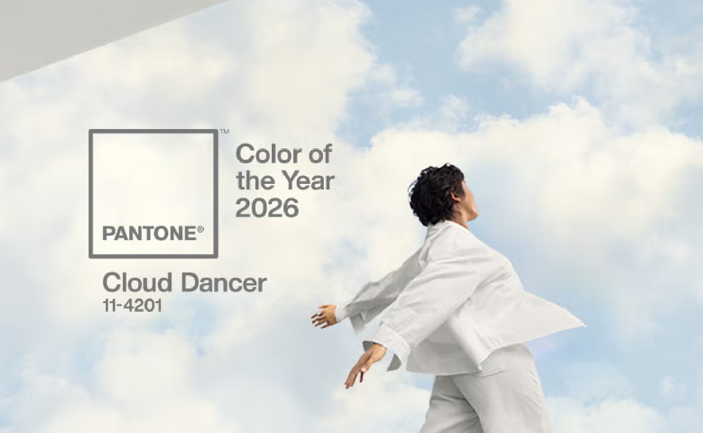
To some, the recently announced Pantone Color of the Year 2026 may seem surprising. Cloud Dancer, a “billowy” off-white shade, appears almost too calm, too unobtrusive for such a prestigious title. Yet this apparent restraint is precisely why Pantone chose it as their crowning color. Its quiet presence, gentle poise, and soothing neutrality are what Pantone believes the overwhelmed modern spirit needs most.
Photo above via Pantone
The name itself evokes lightness, gentle movement, calm, and beauty, and these qualities translate seamlessly into interior design. Simple and discreet, Cloud Dancer has a quiet elegance, yet when used thoughtfully, it can become unexpectedly dramatic, much like clouds in motion across the sky. Unlike many previous Pantone Colors of the Year, which arrived as instant focal points capable of standing on their own, Cloud Dancer asks to be coaxed, layered, and thoughtfully paired. When handled with care, the results are subtle yet striking—spectacular in a deliberately quiet way.
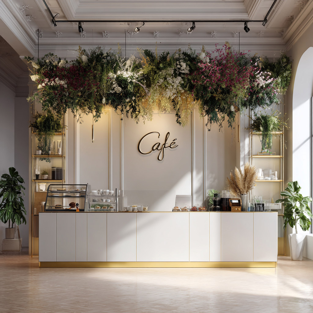
Use of the Pantone Color of the Year 2026 in commercial design
In fact, the color proves especially well suited to commercial spaces. In cafés, for instance, Cloud Dancer works beautifully as a background shade, one that supports the experience rather than competing with it. Places designed for pause, conversation, and momentary escape from the outside world benefit from the tranquility this color offers. Its subtle visual whisper provides relief in environments otherwise saturated with noise, stimulation, and constant demand for attention.
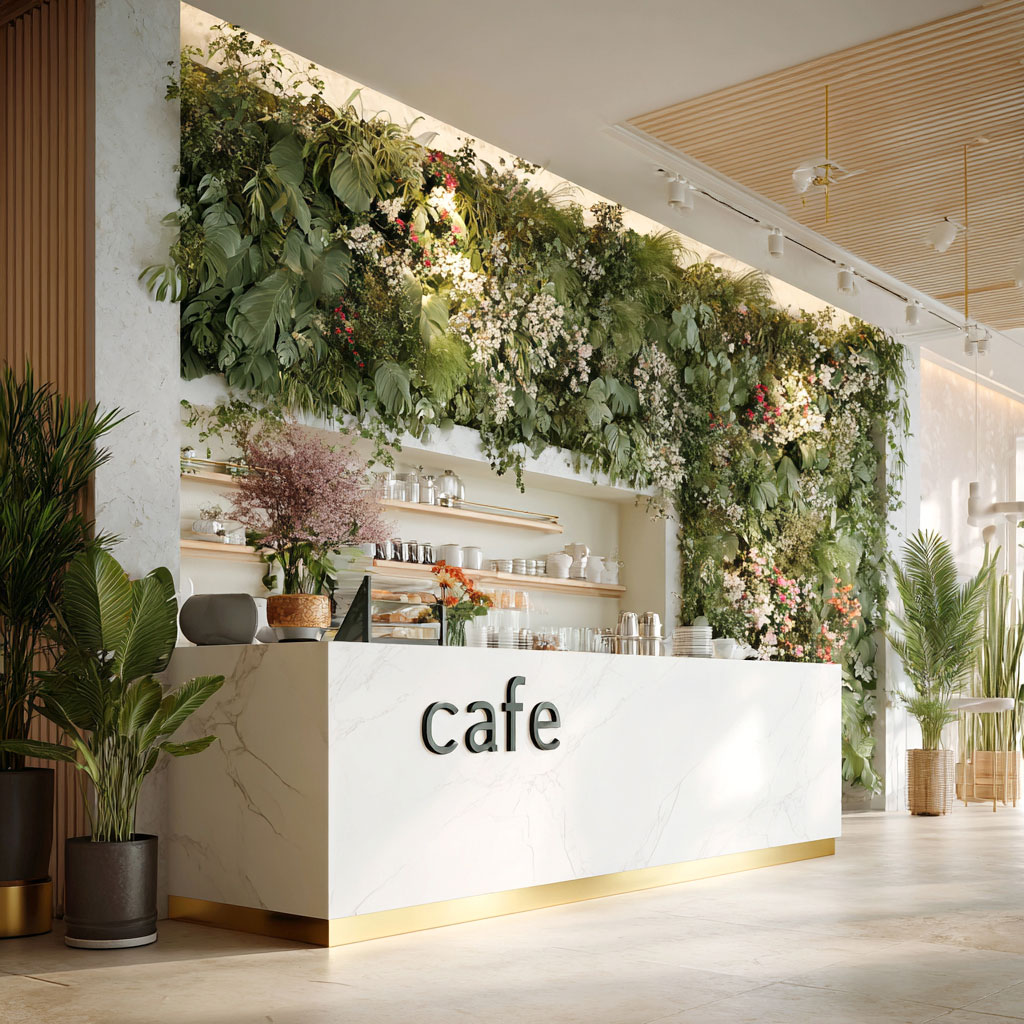
It is fairly easy to see why a white like Cloud Dancer is so valuable in commercial interior design. This neutral shade brightens darker spaces, looks clean and fresh, and provides strong contrast for deeper colors. It allows designers to experiment without the risk of weighing a space down. Its elegance is undeniable, and its ability to make an interior feel well put together is remarkable.
That said, its simplicity can be challenging if not handled carefully. Cloud Dancer almost seems to need a partner in this visual dance, whether through texture, pattern, or the addition of another color.
So, who are these dance partners? Here are a few examples.
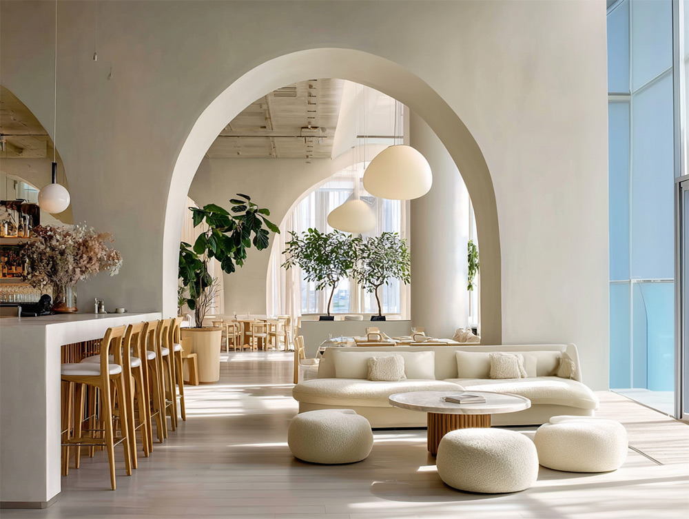
1. Patterns
While Cloud Dancer–painted walls work beautifully on their own to brighten a room or balance heavier shades, this does not mean walls need to remain pattern-free. In fact, an off-white like Cloud Dancer makes an excellent background for patterns. It provides contrast without overwhelming the eye, unlike a stark white. It is, in other words, a friendlier, more livable version of white.
Patterns also tend to stand out more clearly against off-white than against stronger colors, giving them greater visual impact.
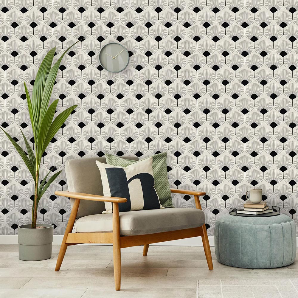
Retro Art Peel and Stick Wallpaper by Coloritto on Etsy
2. Texture
The quiet elegance of Cloud Dancer makes textures really stand out. Even a simple wall art piece or a soft fabric can shine, because this gentle off-white lets textures speak for themselves. In a way, Cloud Dancer acts like a calm backdrop, showing off the tactile and visual details in a space.
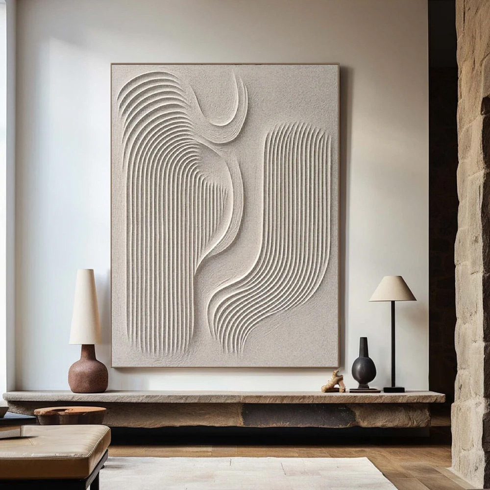
Minimalist Abstract Painting from Artvista
The texture doesn’t have to come from the Cloud Dancer surfaces themselves. A smooth, off-white background makes a perfect stage for other textured pieces in different colors, letting them play a dominant role. At the same time, a creative designer can add enough texture to the Cloud Dancer elements themselves that they almost borrow other shades through visual layering. This way, the calming qualities of Cloud Dancer remain, while subtle visual variation adds depth and interest to the space.
Texture is especially important when there’s a risk of an interior feeling almost sterile. For example, one or a few feather-like pendant lamps can introduce softness and movement, breaking up the monotony of the room.
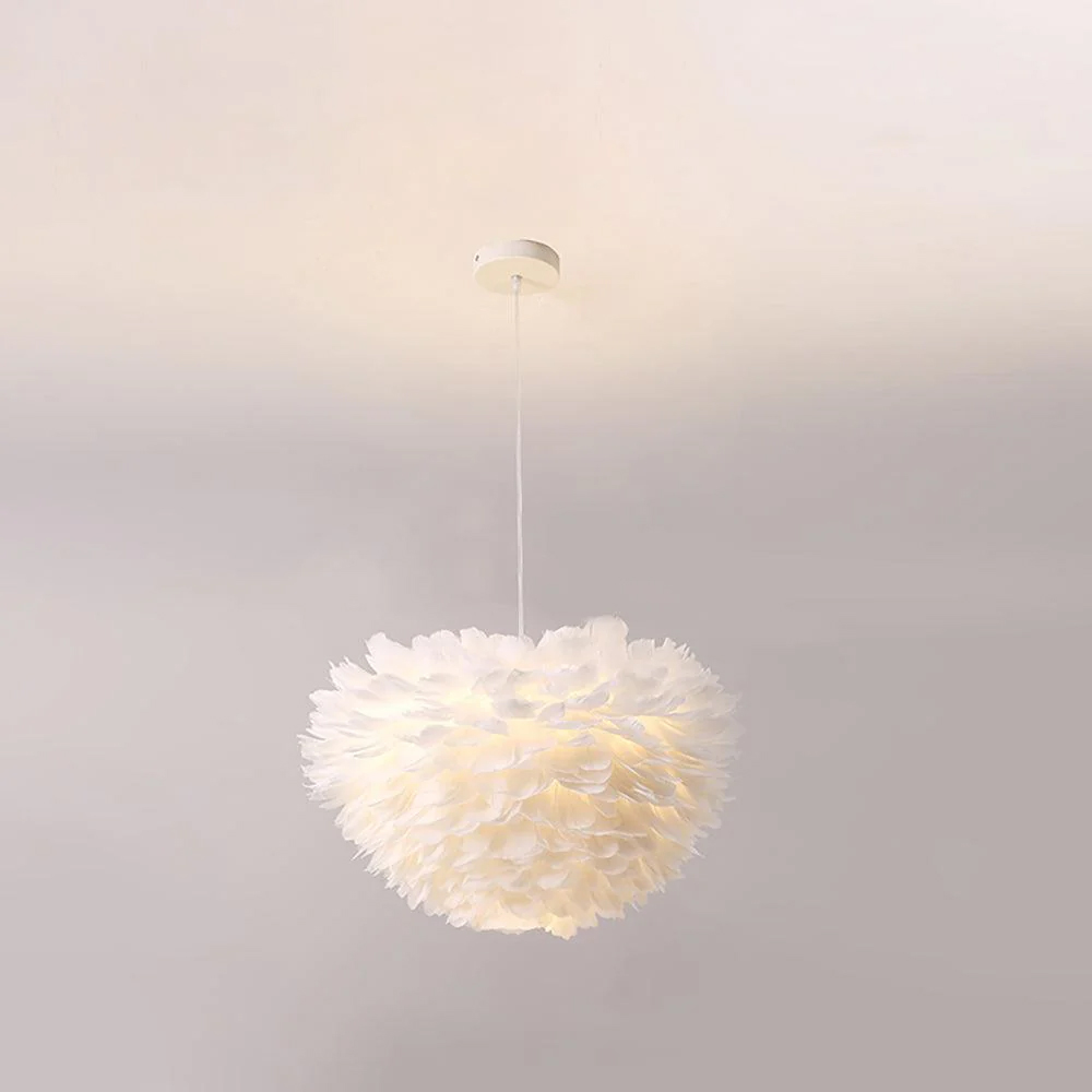
Goose Feathers Pendant Lamp from Vakker Lighting
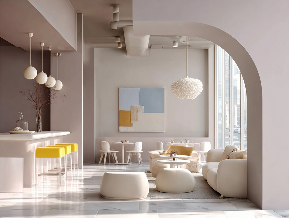
3. Shapes
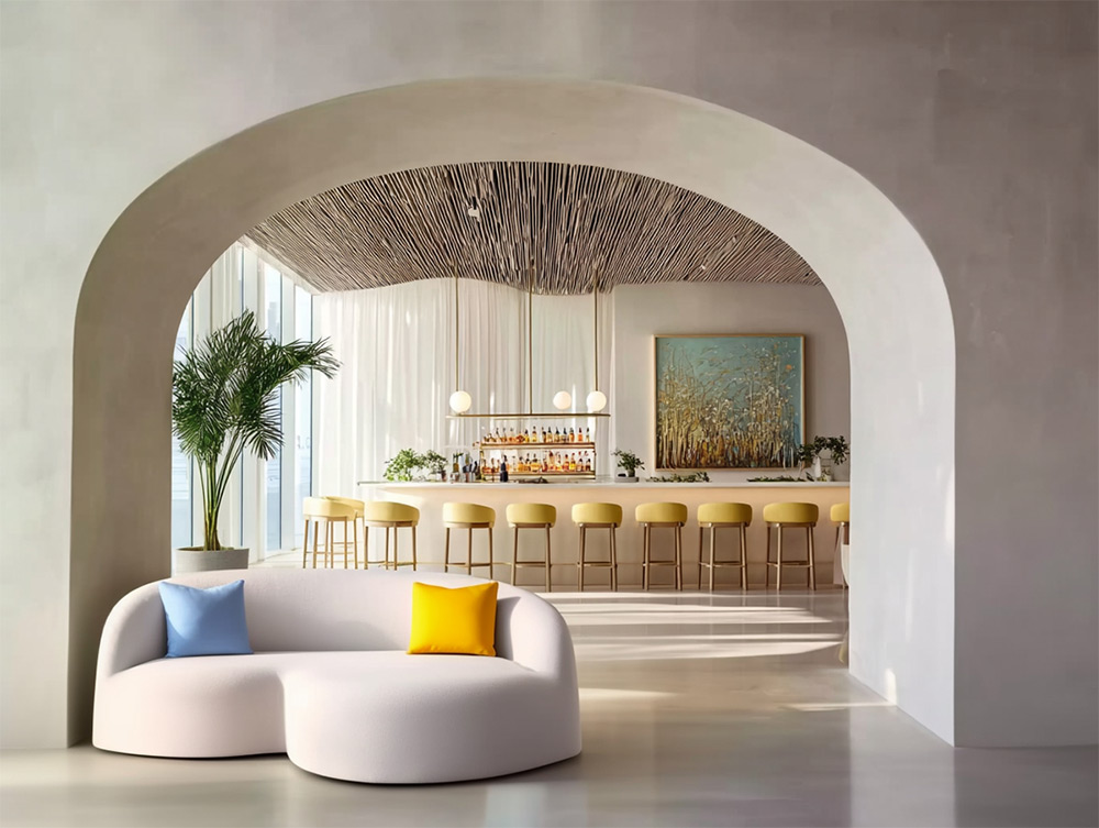
If you’re leaning toward an off-white interior, pairing it with interesting, unexpected shapes can bring the space to life. Of course, you can go for maximum impact and think architectural elements or massive, one-of-a-kind pieces of furniture that steal the show and spark curiosity.
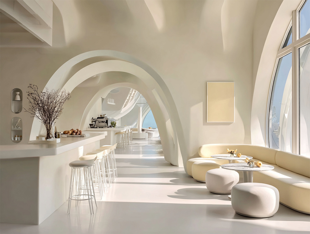
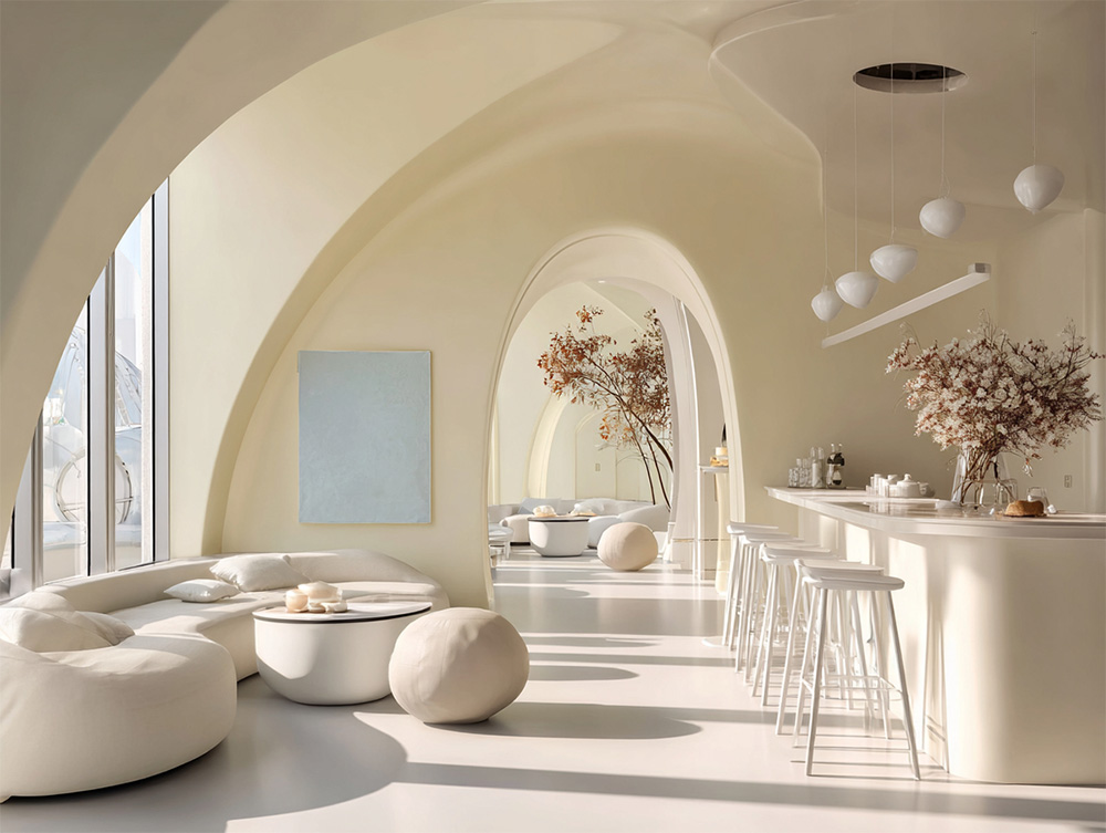
Unexpected shapes in a café interior designed with the Pantone Color of the Year 2026.
For a restaurant, café, or dessert shop, you don’t need to go over the top—sometimes the tables and chairs themselves can speak the language of intriguing shapes, turning simplicity into a statement. Here is just an example of such furniture, with the added benefit of being stackable.
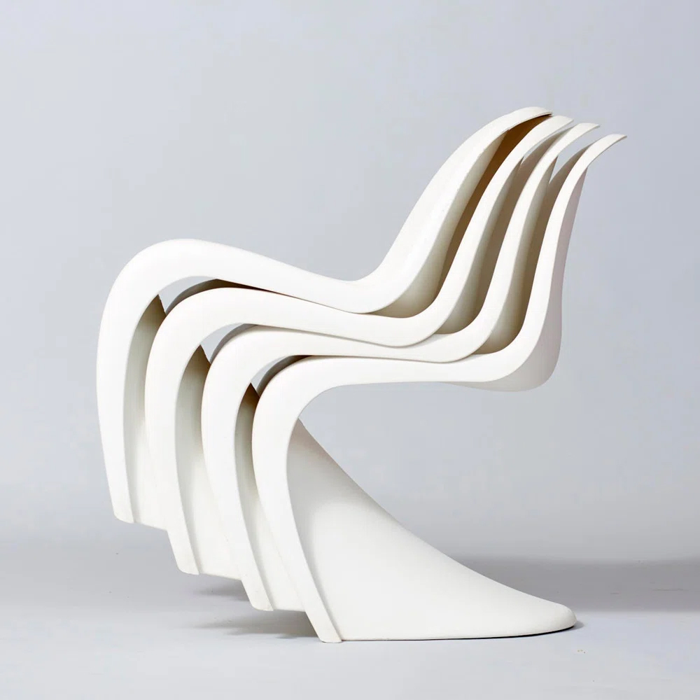
Penton Stacking Side Glossy Dining Chairs from Wayfair
Even minimalist modern chairs in off-white can have a lot of character if their shape is unexpected, sculptural, or slightly quirky.
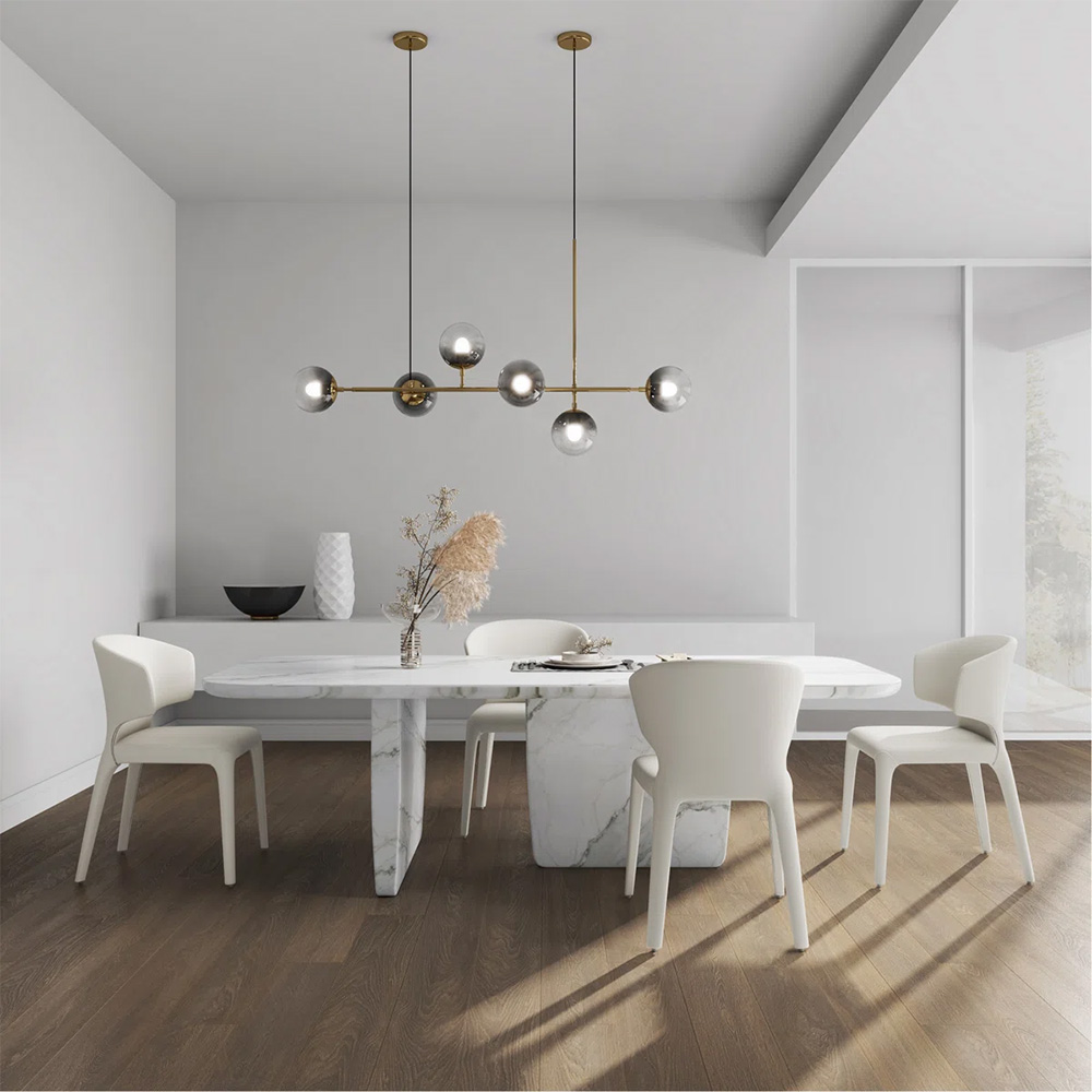
Hokku Designs Dining Chairs from Wayfair
4. Strong Balancing Color
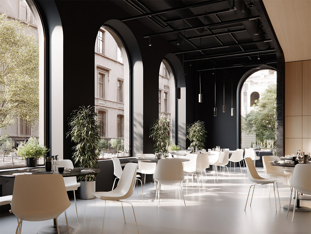
Cloud Dancer is a great chromatic conversationalist. In a color “conversation,” you could say this shade of white is a wonderful listener—its discreet manner and calm appearance almost begs other colors to start talking. When paired with a strong shade, even another neutral, the contrast and visual impact can be striking.
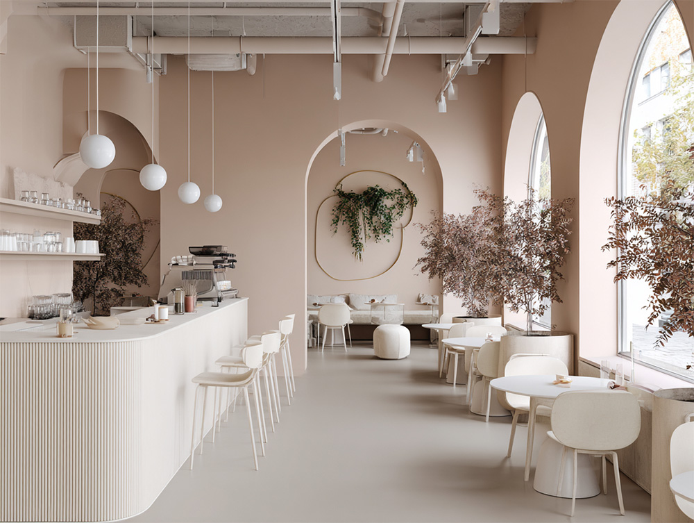
5. Pastels
However, you do not need a strong color as a dance partner for Pantone Color of the Year 2026. The reason is that power often lies in numbers. A few pastels brought together can have an equally pleasant impact as a strong pairing color, even if less dramatic. Paired with soft colors, Cloud Dancer retains its intrinsic tranquility, but with a bit more pizzazz.
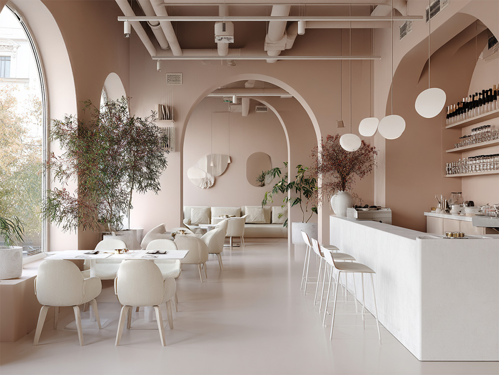
The appeal of pairing off-white with pastels lies in atmosphere rather than contrast. Cloud Dancer creates a calm, open backdrop, while soft hues add warmth and personality without interrupting its tranquility. Instead of stopping the eye, the palette invites it to wander, moving gently from tone to tone. The result is a space that feels soothing yet intentional—quiet, but never flat.
When layered together, pastels gain strength in numbers, forming a harmonious composition that feels curated and emotionally engaging. Paired this way, Cloud Dancer remains true to its light, airy nature, acting as a gracious host rather than a competitor. The overall effect may be less dramatic than a bold contrast, but it offers something more lasting: softness, balance, and a subtle complexity that encourages people to linger.
6. Another Neutral
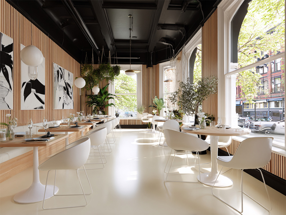
Cloud Dancer pairs naturally with other neutrals, where the relationship is less about contrast and more about balance. Wooden accents are especially effective, introducing warmth, grain, and variation to a color that is otherwise smooth and even. The wood grounds Cloud Dancer, giving it weight and presence, while the overall palette remains calm and understated.
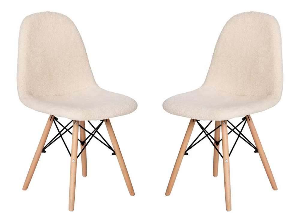
Flash Furniture Zula Modern Padded Armless Faux Shearling Accent Chairs with Beechwood Legs from Target
7. Greenery
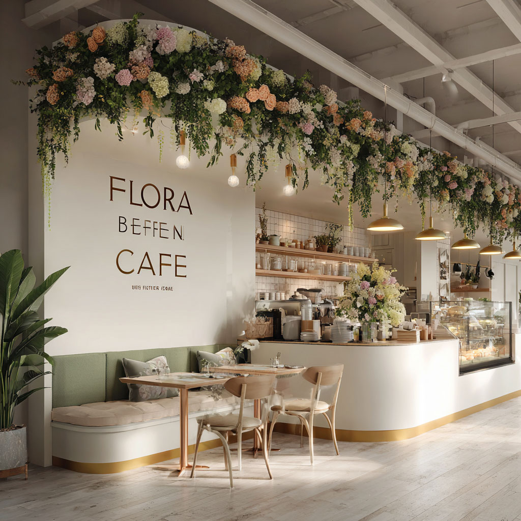
Greenery brings Cloud Dancer into motion. Plants, branches, and natural elements add movement, color, and a sense of life to the space. Paired with something living and imperfect, Cloud Dancer feels softer, warmer, and more intentional.
8. Metallics
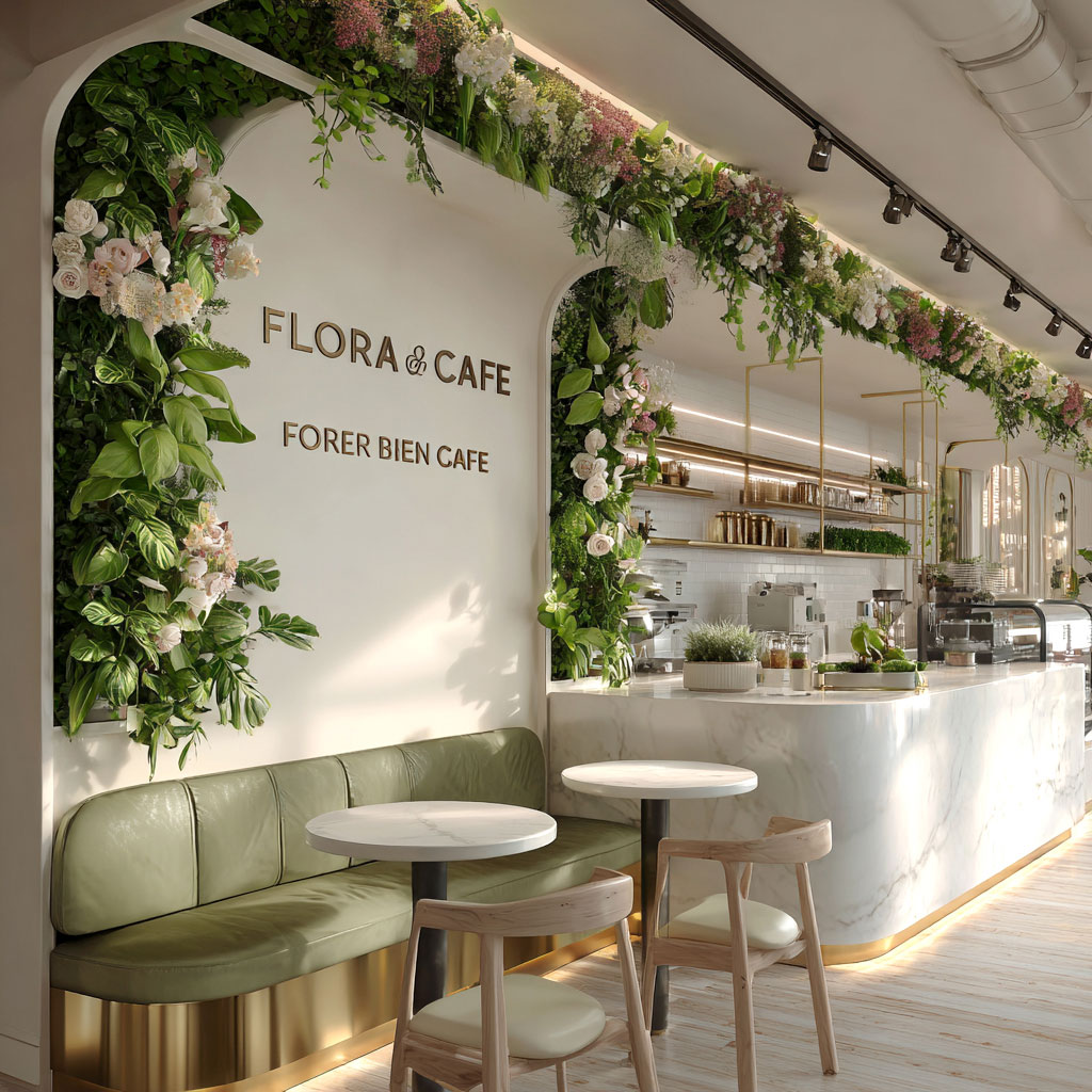
Few combinations are more elegant than Cloud Dancer paired with metallic accents. The color on its own is soft and reserved, but metals like brass, chrome, or muted gold give it something to respond to. The contrast between matte and shine adds just enough movement to keep Cloud Dancer from standing still.
9. Surprise Element
Another dance partner for Cloud Dancer is surprise. Because this off-white shade is so calm and composed, it creates the perfect stage for the unexpected. A single element that feels slightly out of place—a bold material, an unconventional object, an unexpected finish—can instantly shift the mood and hold the gaze.
You can continue to use restraint. One surprising gesture is often enough: a glossy surface in an otherwise matte space, an unusual art piece, a playful lighting choice, or a tactile material that invites touch. Against Cloud Dancer’s quiet backdrop, these moments feel intentional rather than loud, adding character and memorability without disturbing the overall sense of balance.
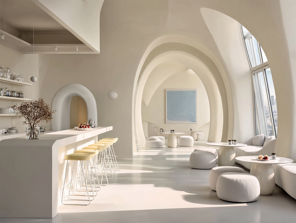
Surprising door frames and architectural details in a commercial interior featuring the Pantone Color of the Year 2026.
Light fixtures make excellent sources of surprise, especially in commercial spaces where updates can quickly become costly. A singular collection of uniquely shaped pendants—maybe even cloud-shaped, why not?—can feel like a bold performance, all with minimal cost and effort.
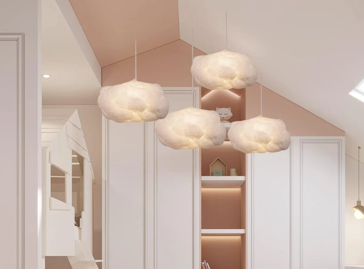
Hanging Cloud Pendant Lighting from Wayfair
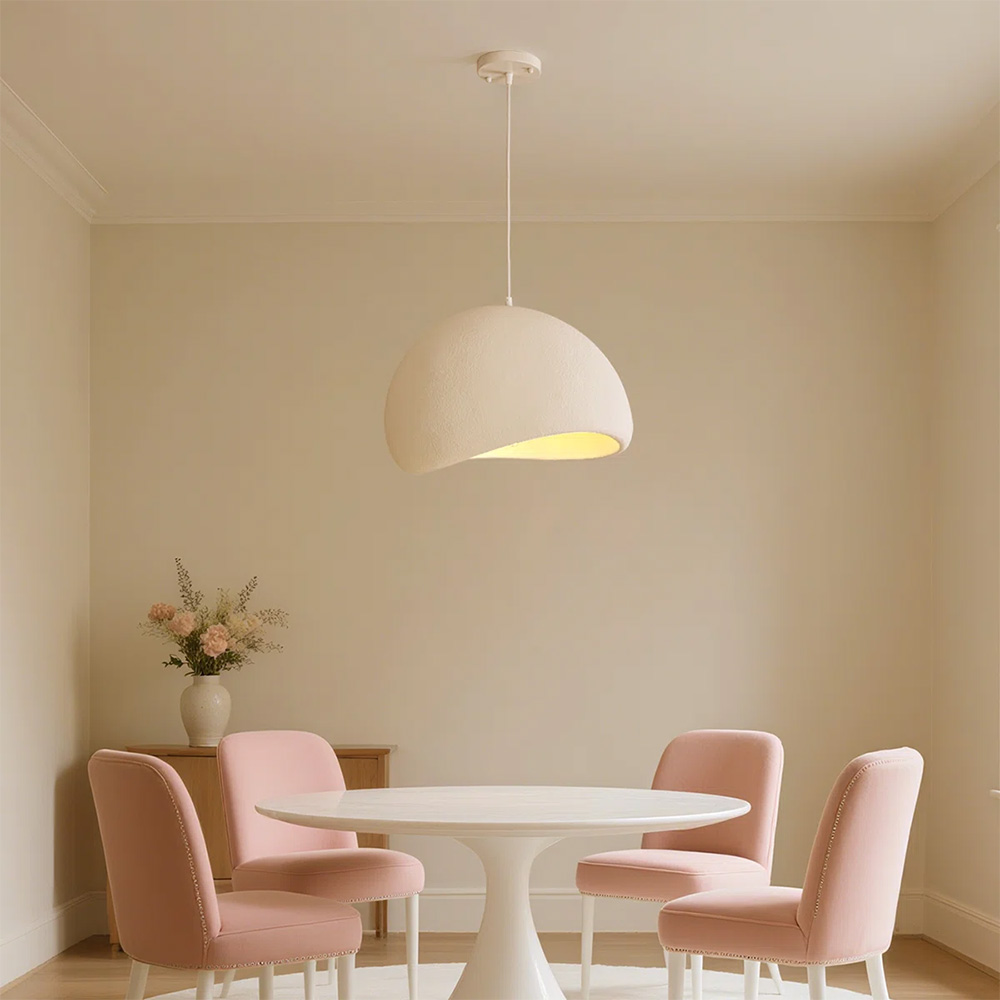
Jimyah Modern Pendant from Wayfair
10. Scale and Architectural Details
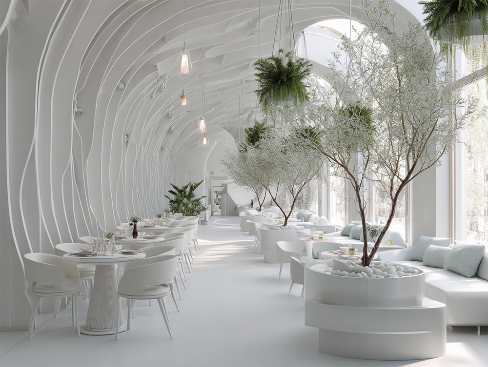
When color is restrained, volume and texture carry the interest. If you prefer a monochromatic look and want to try Cloud Dancer without risking an uninspiring result, go big. In this scenario, you have two great allies, working from opposite sides. First is scale: by scaling up and going bold, an interior that might otherwise feel underwhelming in a monotone chromatic palette can start turning heads through sheer presence.
Second are the details—especially architectural ones. From the landscapes of your walls or ceilings to the roughness of stone in oversized plant containers, the eye is constantly invited to explore, ensuring the space never feels static or dull.
If you are thinking to open a new business or are in the process of rebranding and remodeling your existing business, contact us to get a free consultation from Mindful Design Consulting. Click HERE to price your project design.
Also, take a look at the “Branding By Interior” e-book, the only book written on this subject at this time. It brings insight into how you can turn your business into a market-dominating competitor by using human cognitive responses.
See our Small Store Design Extravaganza: Commercial Interior Design and Branding 01 book about branding small businesses from logo design to construction, with colorful images, offering insightful explanations every step of the way.