

Sunny Scoop is an ice cream and waffle shop that was the last recipient of the Mindful Design Consulting touch. We wanted to create an Asian-inspired dessert store design that does justice to its generous menu of delicious treats while blending natural elements with playful Asian graphic styles. The result is a charming interior, filled with fun accents and pops of color.

The store had a fairly generous area that allowed for comfortable customer flow. This gave us the flexibility to use more than one flooring treatment and highlight the service counter and scoop station with pebble-patterned floor tiles. The counter-side tiles, as well as the wall tiles behind the counter, mirror the shades of the pebble tiles, creating a unified island that keeps the service counter visually distinct.

Behind the counter, large menu boards take center stage in terms of color. A unique feature is the recessed ceiling painted in yellow, creating the illusion of more light, almost as if the sun were peeking through the ceiling. Above the counter, a combination of large and small spherical lighting fixtures keeps the focus on the counter, complemented by under-cabinet lighting in the front.
In this area, the recessed lighting has almost a starry-sky vibe, ensuring that this space, the farthest from the window, receives enough light.
In addition to the pebble-patterned floor, we used wood-plank-looking tiles that offer the same ease of cleaning and maintenance. We continued this dual flooring treatment into the seating area, which helped define distinct zones within the space.
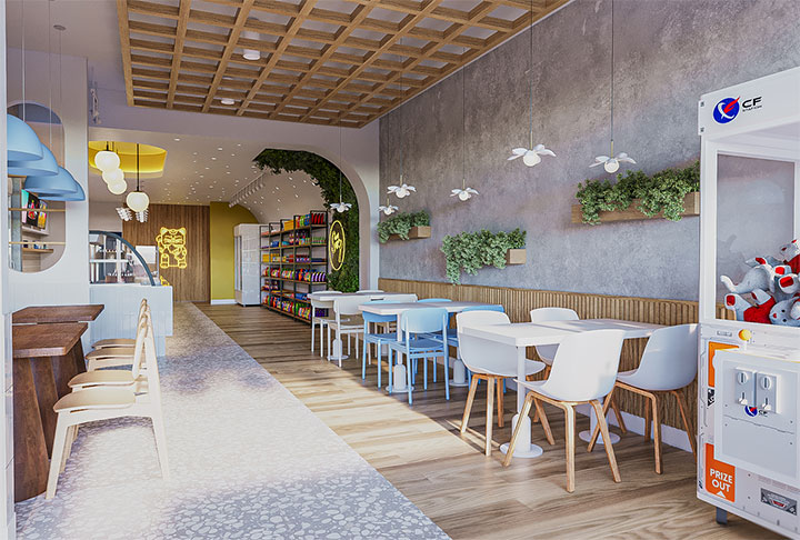
The seating area is filled with details. The two seating zones are treated differently, with distinct furniture and lighting options. However, they are united by the use of wood. The wood wall paneling envelops both zones, continuing the look of the floor. On one side, wooden pedestal tables serve as statement pieces.
We incorporated another pastel color, drawn from the store’s logo, through the blue chairs. This addition helps break up the right seating area and adds more detail to it.
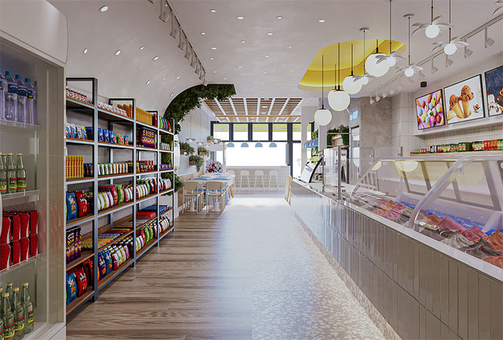
The wood elements are also present on the ceiling of the store. Two large trellises interrupt the expanse of the ceiling and introduce an organic element into the design – quite fitting for an Asian-inspired dessert store. They provide an excellent balance to the wall separating the product display and the seating area. The curve of the wall is emphasized by a lush green display against which a neon sign with the store logo draws attention, providing a great opportunity for taking pictures.
Both the curves and the green theme are repeated throughout the store — one through another green wall and the greenery placed around the space, the other through separating walls with oval cutouts that keep the space open, offer more shelving space, and allow natural light to reach the counter. Taking advantage of this natural light, another seating area offers customers the chance to enjoy their treats while watching the world go by.

We designed the entrance to the store to stand out and tie into the interior theme. The black and yellow contrast catches the eye, while the large logo is displayed both on the facade and the 3D signage.
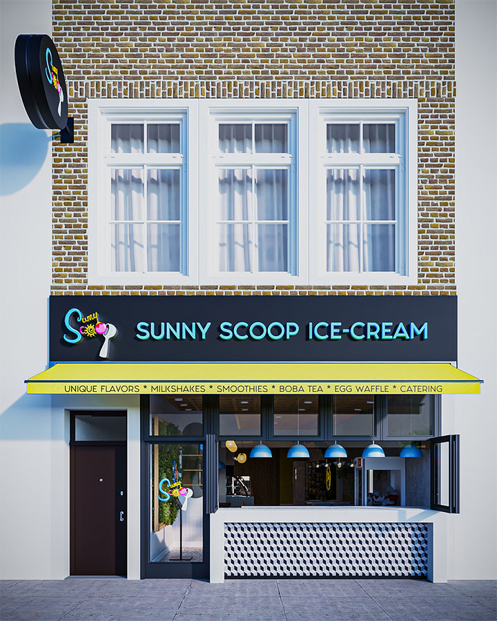
The windows open, allowing customers seated at the counter-height table to feel as if they are consuming their treats on a terrace. They also give passersby a glimpse inside, inviting them in.
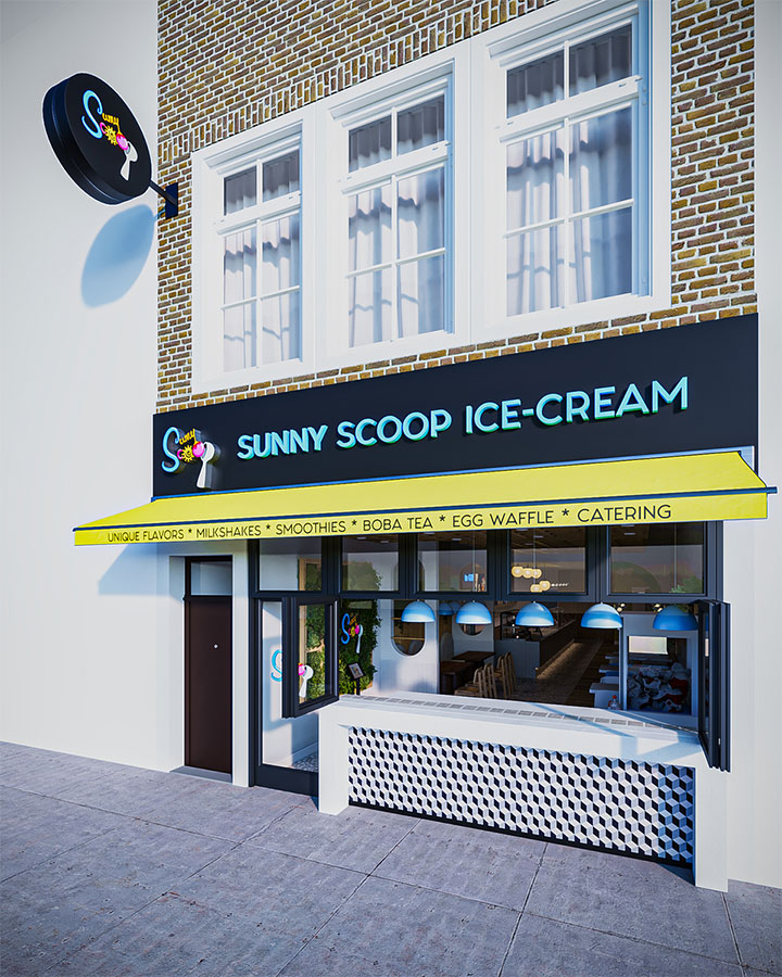
We designed the logo from the clients’ sketch and kept the crafty feel that makes it fun and approachable.

We added multi-use patterns and another Asian-style graphic, which has been turned into a large neon sign placed at the end of the store. The sign gives the area a warmer feel and invites customers to take selfies.
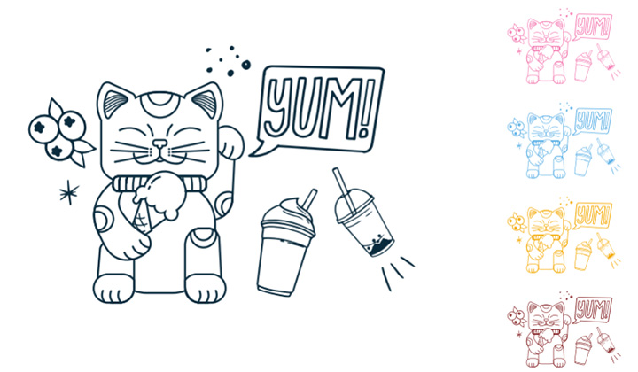
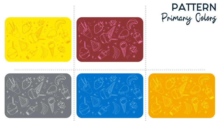
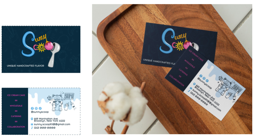
We used both the logo and the graphics in the design of the store’s business cards.
Designer: Mindful Design Consulting
All images: Mindful Design Consulting
Also, take a look at the “Branding By Interior” e-book, the only book written on this subject at this time. It brings insight into how you can turn your business into a market-dominating competitor by using human cognitive responses.
See our Small Store Design Extravaganza: Commercial Interior Design and Branding 01 book about branding small businesses from logo design to construction, with colorful images, offering insightful explanations every step of the way.





Leave a Reply
Want to join the discussion?Feel free to contribute!