
Why Designing Without a Clear Customer in Mind Fails Restaurants

Some restaurant spaces look perfect on paper, yet still feel off once they open. The design is solid, the branding is clear, and the concept makes sense, but the experience doesn’t quite land. More often than not, that gap has less to do with execution and more to do with what was never clearly defined from the start: the customer.

Movita Juice Bar design by Mindful Design Consulting. A clear, efficient layout designed for a young, health-conscious audience and quick turnover.
When the concept is clear, but the customer isn’t
A lot of restaurant concepts start the same way, with a vision. It might come from a menu idea, a specific cuisine, or even just a general feeling like “modern,” “cozy,” “premium,” or “Instagrammable.” From there, design decisions begin to take shape as materials are selected, colors are defined, lighting is chosen, and furniture is brought in to complete the space.
These decisions are not necessarily wrong. The issue is that without a clearly defined customer guiding them, they rarely come together in a meaningful way. What you end up with is a space that looks good at a glance but lacks a clear sense of purpose. That disconnect may not be immediately obvious, but it becomes apparent in how people interact with the space, how long they stay, and whether they feel compelled to return.
This sometimes happen in fast casual concepts aimed at a younger, high-traffic lunch crowd. The pricing and menu support that direction, but the interior often tells a different story. Dark finishes, lower lighting, and tighter seating can make the space feel more formal than intended. Customers looking for a quick, easy stop do not always feel comfortable moving through that kind of environment at the intended pace. Turnover slows, lines become more noticeable, and the overall experience starts to feel slightly misaligned. In such cases, the issue is not poor design execution. In fact, the space may be well designed, but it is not aligned with how the target customer actually behaves.
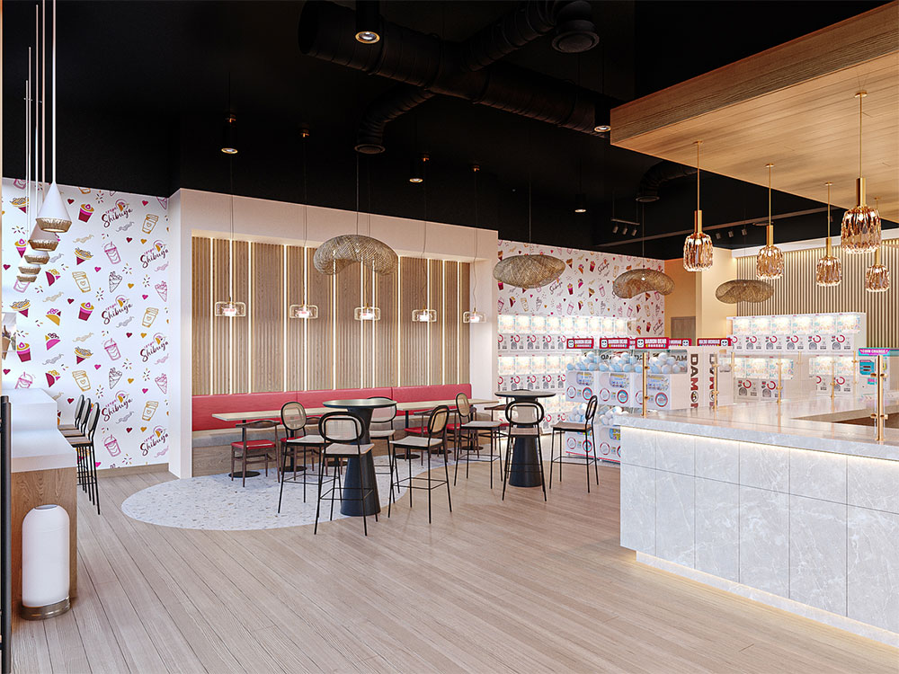
Crepe Shibuya Japanese dessert store design by Mindful Design Consulting. A go-to destination for children and adults who love authentic Japanese culture and treats.
If not tied to a customer, design is just decoration
Without a clearly defined customer, design decisions shift from strategy to preference. A feature wall is added because it looks good, lighting is chosen because it feels current, and seating is mixed for variety. Over time, the space becomes a collection of ideas rather than a cohesive experience.
In some dessert or beverage concepts, this shows up in how the layout is handled. Symmetry and visual balance take priority, with seating spread evenly and a central feature acting as the main focal point.
At first glance, the space may feel clean and well composed. But without a clear understanding of the customer, it does not support real behavior. Ordering, waiting, and seating overlap in the same areas, and during busy periods the space feels less clear in how it should be used. Groups are unsure where to settle, and individual customers hesitate in areas that lack purpose.
In situations like this, design stops guiding experience and starts acting as decoration. It looks complete, but it does not shape how the space actually works.
When the customer is carefully defined, the same space becomes more intuitive. Movement feels natural, seating has intent, and visual elements support behavior instead of simply filling space.

Hey!FroYo frozen dessert shop design by Mindful Design Consulting. Designed for young, modern families and adults seeking a fun, community-focused space.
The fastest way to spot the problem
If you walk into a space, you should be able to immediately tell:
- who it is for
- how long people are expected to stay
- how they are meant to order and move through it
If that is not evident, it’s usually a sign the customer was not defined during the design process. When it is, no explanation is needed.
Beyond aesthetics, design directly shapes how people behave in the space. It influences how they move, order, sit, and spend. A layout designed for quick turnover should support speed and flow. A space designed for longer stays should feel comfortable and relaxed. If the audience is social and digital, the environment should naturally encourage interaction and sharing. In simple terms, clarity about the customer drives clarity in design.

Pablito’s Tacos restaurant by Mindful Design Consulting. A place for a quick taco, hanging out with friends, or enjoying a meal with family, while soaking in a touch of cultural flavor.
Why “everyone” is not a target customer
“We want to appeal to everyone.”
This is one of the most common and costly mistakes in restaurant design. Trying to appeal to everyone usually leads to neutral decisions across the board, where nothing feels too bold, too specific, or too polarizing. On the surface, this might seem like a safe approach, but it often results in spaces that are acceptable to many people without being memorable to any.
Different concepts require very different environments. A family focused dessert shop needs room for groups, movement, and a bit of noise. A late night boba spot benefits from higher energy, expressive lighting, and social seating that encourages gathering. A premium café, on the other hand, relies more on comfort, pacing, and a controlled, quieter atmosphere. Each of these directions works on its own, but blending them together removes clarity.
In a similar scenario, a franchise operator may aim for a balanced design meant to appeal to all demographics. However, once the intended customer becomes more apparent, it often turns out the strongest audience is younger, social, and high frequency. When the design shifts to reflect that, with a more dynamic layout, clearer branding moments, and less neutral seating, the space becomes easier to understand and performs more consistently.

Texas Donuts shop design by Mindful Design Consulting. A quick, dynamic stop for sweet treat lovers.
Design decisions shape how people spend
Design is often treated as a visual layer, but it directly influences customer behavior. Some bubble tea shops increase group orders simply by organizing the counter and menu in a more precise way, so people can easily decide together instead of ordering individually. In other cases, ice-cream shops unintentionally reduce how long people stay by placing seating directly along the main walking path, which makes the space feel more like a quick stop than a place to sit and spend time.
There are also dessert cafés where the pickup point sits too close to the ordering queue, which creates uncertainty in how people move through the space, especially during busy periods. Even when service is fast, the experience can feel less simple, and customers tend to leave sooner than intended. On the other hand, some concepts improve repeat visits simply by creating a more comfortable environment that encourages people to stay longer instead of treating the visit as transactional.
Far from being random, these outcomes are all tied to whether the space was designed around real customer behavior, or just a general idea.

Urban Bubble/Ssong’s Hotdog cafe design by Mindful Design Consulting. An all-in-one destination for those looking to grab a bite alongside a cup of boba tea.
When the customer is clear, everything else gets easier
This is often the shift most operators do not expect. Once the target customer is properly defined, design decisions stop feeling subjective or based on preference. The conversation naturally moves away from “Do we like this?” and becomes more focused on “Does this make sense for how our customers actually use the space?”
For example, in a bubble tea concept aimed at students and young social groups, the clarity of the audience can completely change how the space is planned. Instead of spreading seating evenly throughout, more of it is concentrated in group-friendly zones near windows or walls where people naturally gather. The counter is designed to handle shared ordering, where one person can easily place multiple drinks without slowing the line, and the menu is structured to highlight popular combinations rather than overwhelming choice. Even small details, like leaving a clear standing area near pickup, are intentional because that customer is more likely to come in groups, wait together, and spend time inside.
With that level of clarity, there is no need for overdesigning or constant second-guessing. Every decision has a purpose, and everything starts to feel aligned.
That alignment is not only visible in how the space looks, but more importantly in how it performs once people actually use it.

Swirlicious frozen-yogurt store by Mindful Design Consulting. Offering quick, delicious treats for those seeking fun, Instagrammable dessert experiences.
It’s not about limiting your audience
Defining a customer doesn’t mean excluding people. It means creating a space that performs especially well for a specific group, while still remaining open to others. The strongest concepts are usually not broad or neutral, but built around a certain way of using the space.
For example, a bakery designed around early morning commuters will prioritize speed and precision above everything else. Products are visible at a glance, the queue moves in a straight flow, and there is almost no hesitation in ordering. On the other hand, a dessert lounge in a shopping district may be designed for browsing and staying longer, with display-led ordering, slower pacing, and seating that encourages people to sit down and spend time rather than leave immediately.
In both cases, the space can still attract different types of customers, but the experience is intentionally shaped around a primary behavior.
That level of clarity is often what makes a space memorable. When a space is memorable, people return because they immediately understand what kind of experience they are walking into.

Crest Taco kiosk by Mindful Design Consulting, designed for taco-loving passersby looking to rest and grab a bite.
Start here or fix it later
Before materials, layouts, or branding, one question matters most: who is this space actually for? Not in general terms, but in practical ones. How they order, how long they stay, who they come with, and what they expect when they walk in.
When that is clear, design stops being subjective and starts becoming a tool that supports real behavior. When it is not, decisions drift, and the space slowly loses focus. By the time it is built, those issues are much harder and more expensive to fix.

Scoops La Jolla ice-cream shop by Mindful Design Consulting. An easygoing hangout spot for ocean lovers.
If you are thinking to open a new business or are in the process of rebranding and remodeling your existing business, contact us to get a free consultation from Mindful Design Consulting. Click HERE to price your project design.
Also, take a look at the “Branding By Interior” e-book, the only book written on this subject at this time. It brings insight into how you can turn your business into a market-dominating competitor by using human cognitive responses.
See our Small Store Design Extravaganza: Commercial Interior Design and Branding 01 book about branding small businesses from logo design to construction, with colorful images, offering insightful explanations every step of the way.